i love weddings
I’m terribly forgetful when it comes to gift purchasing. This is why I’ve opted to design and produce wedding invitations for some of those closest to me. Indeed, they are a bear when you’re in the thick of it but I’ve had the opportunity to create some nice pieces on a shoestring budget. The invite for my sister’s upcoming nuptials proved to be no different. When initially considering the project, I had a nagging feeling that the traditional A7 white envelope wasn’t the right fit… but I’d not yet determined what was. If it came down to it, I could whip together something nice, albeit removed from the characteristics that make this couple unique.
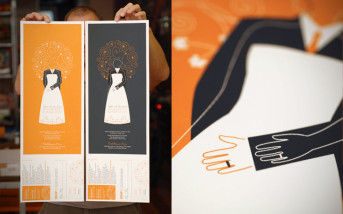
At the 11th hour, it was their love of live music that gave this invite serious wheels. It couldn’t be anything other than a show poster… screen printed with a simple and elegant image symbolizing the biggest day in their relationship up to that point. Several messages exist including the notion of an overlapping of lives. Yet they face different directions because at the end of the day, we are all unique and it’s important to be so. I’ve written about such things before. The RSVP and directions were as part of the entire poster which was printed magnificently at Southpaw Prints. It was then hand-perfed, wrapped in tissue paper to prevent off-setting, sealed with a sticker and sent out via mailing tubes. I used a custom stamp with black ink for the return address on the backside of the RSVP in lieu of paying for the hit on the backside of the poster. I wanted this piece to live on. The intent was that you could frame it and hang it long after the wedding day.
In all, it was a ton of work but well worth it. The invite tells a great story and that’s about as much as you can ask for.

