Each year, Boys Hope Girls Hope of Cincinnati provides a group of local youth what they need to overcome broken homes, broken neighborhoods and disruption in their lives that we take for granted. They couldn’t do that without generous donations from the community and one of the ways they engage the their neighbors is through yearly fundraisers. I was given the opportunity to create a system of marks they could use for several of those fundraisers. By creating a system, it began to create recognition for the non-profit in regards to promoting these events.
Portfolio
Worked in conjunction with Envoi Design to develop an internal logo for Mattel toys. We wanted to maintain the strong heritage of the Mattel badge and reinforce that with the circular elements. The color choices were developed to move things from the primary that is usually seen on shelf but still be lively, fun and interactive.
Innovative, award-winning toy designers with a not-so-award-winning site. Their space is fun, hip and vibrant and so are their employees. We wanted to reflect that as well as the creative process in the site design – hence the sketchbook – which was mine that I shot on a light table to pull off the glow in the background. This project ended up being lots of fun and a learning experience for everyone.
The objective of this round was to take a fresh look at photography as well as navigation. The front panel became cluttered and clunky after multiple rounds of work.By eliminating elements and providing balance, legibility was restored. And with the success of the “activation” study, the graphics of that work was incorporated into the photography.
As new packaging for Eukanuba began to roll out, there was the challenge of how the new assets would help tell the nutrition story. As a team, we were tasked with creating story boards depicting the moment the food began to activate inside the dog. I wanted to allow the beauty of an animal in full motion play the hero as well as the molecular science that went into each piece.
A local not-for-profit agency recently overhauled their brand image and assets. I was fortunate enough to be a part of the early phases. Their entire look, even the name was changing so I wanted to maintain the childlike qualities in order to not depart entirely from their history. However, I didn’t want to do it in the traditional sense of kid-written type and poorly drawn illustrations. So what else do kids do? They build. A lot. Not only that, but the way they learn is much akin the building of blocks. So that’s where I started. I roughly “built” the brand mark.
A local food truck vendor was in need of graphics and an identity before she hit the streets. With the visual chaos that can sometimes be the urban scene, I wanted to create a disruptive system with color while allowing the graphic system to be very structured.
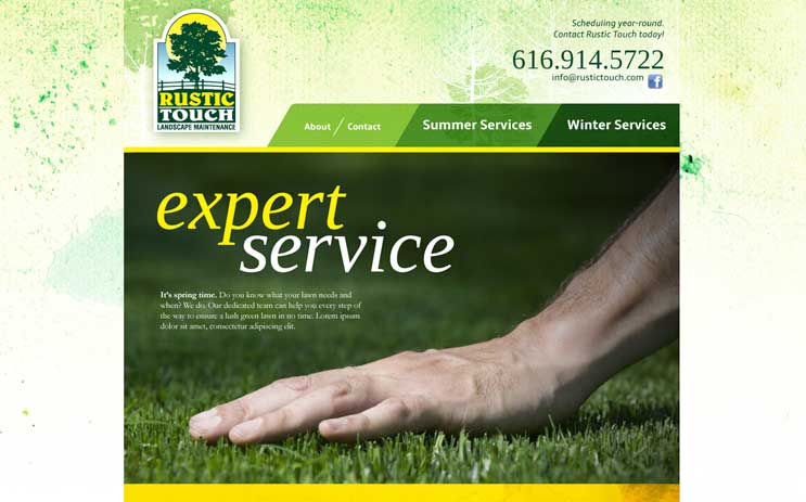
Based in Michigan, this family-owned landscaping business is well aware of the change in seasons and the need to adapt based on the climate on any one particular day. Offering an array of services for both the winter and summer months, and not knowing how the business might grow in the future, I split the information by season to ease navigation and future expandability. The original idea was the home page would actually be split using a script that would allow the “Summer” home page to become more visible as the solstice approached and vice versa. The “Winter” home page would become more visible as its own solstice approached. That proved to be a lot of work so we ended up with four visually-distinct home pages to mark the change in seasons and alert customers and users of the site to the change in landscaping needs. Four sites rolled into one.
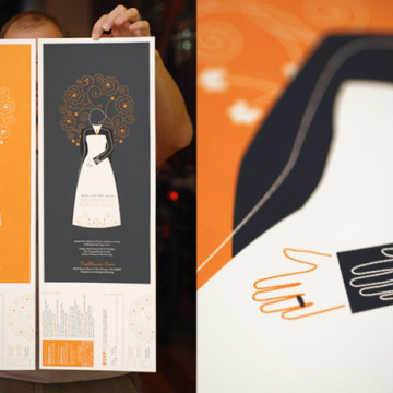
I’m terribly forgetful when it comes to gift purchasing. This is why I’ve opted to design and produce wedding invitations for some of those closest to me. Indeed, they are a bear when you’re in the thick of it but I’ve had the opportunity to create some nice pieces on a shoestring budget. The invite for my sister’s upcoming nuptials proved to be no different. When initially considering the project, I had a nagging feeling that the traditional A7 white envelope wasn’t the right fit… but I’d not yet determined what was. If it came down to it, I could whip together something nice, albeit removed from the characteristics that make this couple unique.
At the 11th hour, it was their love of live music that gave this invite serious wheels. It couldn’t be anything other than a show poster… screen printed with a simple and elegant image symbolizing the biggest day in their relationship up to that point. Several messages exist including the notion of an overlapping of lives. Yet they face different directions because at the end of the day, we are all unique and it’s important to be so. I’ve written about such things before. The RSVP and directions were as part of the entire poster which was printed magnificently at Southpaw Prints. It was then hand-perfed, wrapped in tissue paper to prevent off-setting, sealed with a sticker and sent out via mailing tubes. I used a custom stamp with black ink for the return address on the backside of the RSVP in lieu of paying for the hit on the backside of the poster. I wanted this piece to live on. The intent was that you could frame it and hang it long after the wedding day.
In all, it was a ton of work but well worth it. The invite tells a great story and that’s about as much as you can ask for.
This client sought to have a site built where he could counsel future patients via Skype. The subject matter was sensitive therefore we took great care as to how he would come across visually. The idea that he is well-respected, intelligent and compassionate were imperative and remained a focal point throughout the project. We felt it necessary to provide as much, personally, from the Personal Identity Coach as possible and were able to pull off a photo shoot at the Mercantile Library in downtown Cincinnati. It was the perfect locale and gave us the exact feel the site needed.