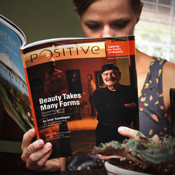
Round two is fresh off press. The 100-page publication has taken a turn towards the more traditional as there is now a set demographic and a clearer focus. In this edition, ads were implemented along with several new articles. With the focus tightened up, the goal was still to find each article’s unique quality and capitalize on it. For Lebowskifest, the clean clipping paths and full-bleed images didn’t seem appropriate for such anarchy-fueled subject matter. In turn, with the travel section’s An Irish Travelogue: Waking Dream’s opening spread, I wanted to convey the dreamlike quality of the writers’ thoughts as well as play off the area known for rollings banks of fog and mist.
Portfolio
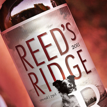
A local family distributed their fine wares amongst friends and wanted a little more class when the gifts made their way to the table. They wanted a mark, or ligature, of some kind to tie in other products they might delve into. As a husband and wife team, the two “R”’s reversed seemed to make the most sense to them so it was just a matter of making it work. Along with creating a delicious red, the clan breeds and sells border collies on their farm in the hills of the bluegrass state. The lower perspective pays respect to the canine known for its intelligence, leadership and work ethic. It’s the image that pulls all the great things about Reed’s Ridge together.
My family (in a roundabout way) runs a tavern in my hometown that has been serving up food and drinks for a long long time now. Nearly 100 years. That same hometown happens to lie on Interstate 75 which makes its exits particularly valuable for chain restaurants… and as evidence would indicate makes hole-in-the-wall local joints fall to the wayside. But a few years back, the great-grandson of the guy that started it all would head home on the weekends, make up a bunch of dough and bake up some pretty extraordinary pizzas on Monday night. It was inspiring what this one contribution had accomplished so I felt compelled to mock up some t-shirts so they could put them on hangers and possibly make a little extra money in the process.
After having worked on Kestner Waggoner’s brand, they came to us needing a visual revamp of their site along with the ability to update content on the fly. The design picked up on the established color and style of the mark and printed collateral. And while this client worked on the more restorative side of construction, it was construction nonetheless. The solid block of deep red helped bring some muscle into layout while the thin rules on the border hint at the elegance of historical woodworking. This site is a good example of finding balance in design.
The Cincinnati Art Museum recently ran a show on the Amazing American Circus Poster. Extraordinary pieces that ran the length of entire rooms in some cases that were wonderfully painted eons ago but maintained sometimes by sheer luck. After several rounds in-house, we were asked to have a look at it and give them our thoughts.
The size of the actual posters alone was hard to convey on such a small medium but the real problem was hierarchy… or lackthereof. Rather than focusing on a entire poster, I pulled a single compelling element out of one of them. I also pulled what seemed to be the headline out of the single line of text in the old ad and created a piece of art out of it to correspond with the image. We created a single space for the sponsors’ logos, sized down the “branding” for the show and put it together with the branding of the museum. The revised piece (on the right) provides the ad with a focal point and clear breaks of space for the secondary content.
Ross Van Pelt is a phenomenal Cincinnati-based photographer with a long list of clients. Hard-working, efficient and extremely versatile, it was tough to nail down just one style that he relies on. So I approached the idea of “layers” with this typographic solution. I was also looking for a unique alternative to the oftentimes predictable world of photography branding. Oh and he’s got a great sense of humor. Otherwise, I would’ve never shown him the Ross (Bob Ross’s head) Van (mini-van) Pelt (beaver). Luckily, he got a kick out of it as much as I did.
Fairway Capital Recovery (FCR) is a Cincinnati-based asset recovery firm. In a market dominated by red, black and chrome, FCR wanted to soften its image in order to stand out but not its approach to recovering funds. Initially, the idea was to show, iconically, how FCR helps to put the pieces back together. The concept of the “missing piece” was very prevalent in the early goings. But much like everything else, it evolved and became the three-dimensional box present in the final art. The colors, while strong, offer an openness not often found in the industry. The same can be said for the choice of type in the mark, as the slightly rounded corners of the serif face achieve that same effect. FCR’s belief in their branding has also helped to develop their look in the form of print collateral, online experience and in-office environment.
Fairway Capital Recovery’s new identity is a strong presence in the asset recovery market and will be for years to come.
The toy company, Ohio Art, maker of the iconic Etch-a-Sketch recently needed a revamp of their toy catalog for the sales year, 2012. With as many toy variations as Ohio Art has, the real problem was finding a way to make the catalog a single unified piece while allowing each toy’s own unique personality to come through.
Shapes immediately came to mind for the unifying element and after that, it was simply a matter of making it work. The patterns developed were each unique depending on the content of the page. They each came together to create an interesting visual texture in and of themselves. The colorful and vibrant tones spoke of Ohio Art’s main focus: toys for children. The negative spaces created by the overlapping angled blocks allow plenty of room for the product descriptions and barcodes.
Initially, this had all the earmarks of an “opportunity” to do something for your family that ends up taking way too much time and getting the desired result is so stressful that you swear off helping anyone ever again. And then, it was different. After all, I couldn’t let them put a crappy granite lighthouse on top of my grandparents. Collaboratively with a sculptor in Logan, the final piece came together seamlessly. Aside from type limitations, there was a considerable amount of freedom in the design of the stone. So much, in fact, my final sketches were able to become reality. The overall shape suggests an infinite love. Several smaller messages exist that only family might pick up on such as the St. Christopher medallion inserted into the foot of the stone.
Concept backboards for the long-standing Nerfoop line of kids’ basketball toys. High energy, high impact graphics that children enjoy having on their walls as much as they enjoy shooting the plush ball through the hoop. The examples shown cover several themes: NCAA Tournament, iconic 80’s imagery as well as generic filler backboards for all seasons.