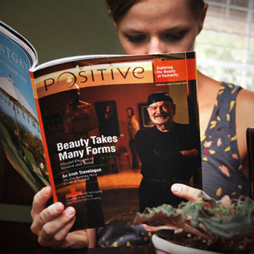
Round two is fresh off press. The 100-page publication has taken a turn towards the more traditional as there is now a set demographic and a clearer focus. In this edition, ads were implemented along with several new articles. With the focus tightened up, the goal was still to find each article’s unique quality and capitalize on it. For Lebowskifest, the clean clipping paths and full-bleed images didn’t seem appropriate for such anarchy-fueled subject matter. In turn, with the travel section’s An Irish Travelogue: Waking Dream’s opening spread, I wanted to convey the dreamlike quality of the writers’ thoughts as well as play off the area known for rollings banks of fog and mist.
The Cincinnati Art Museum recently ran a show on the Amazing American Circus Poster. Extraordinary pieces that ran the length of entire rooms in some cases that were wonderfully painted eons ago but maintained sometimes by sheer luck. After several rounds in-house, we were asked to have a look at it and give them our thoughts.
The size of the actual posters alone was hard to convey on such a small medium but the real problem was hierarchy… or lackthereof. Rather than focusing on a entire poster, I pulled a single compelling element out of one of them. I also pulled what seemed to be the headline out of the single line of text in the old ad and created a piece of art out of it to correspond with the image. We created a single space for the sponsors’ logos, sized down the “branding” for the show and put it together with the branding of the museum. The revised piece (on the right) provides the ad with a focal point and clear breaks of space for the secondary content.
The toy company, Ohio Art, maker of the iconic Etch-a-Sketch recently needed a revamp of their toy catalog for the sales year, 2012. With as many toy variations as Ohio Art has, the real problem was finding a way to make the catalog a single unified piece while allowing each toy’s own unique personality to come through.
Shapes immediately came to mind for the unifying element and after that, it was simply a matter of making it work. The patterns developed were each unique depending on the content of the page. They each came together to create an interesting visual texture in and of themselves. The colorful and vibrant tones spoke of Ohio Art’s main focus: toys for children. The negative spaces created by the overlapping angled blocks allow plenty of room for the product descriptions and barcodes.
In the same vein as the forgotten logos, these proposed hand-held brand identifiers never made it to the production line but are worth a look.