Innovative, award-winning toy designers with a not-so-award-winning site. Their space is fun, hip and vibrant and so are their employees. We wanted to reflect that as well as the creative process in the site design – hence the sketchbook – which was mine that I shot on a light table to pull off the glow in the background. This project ended up being lots of fun and a learning experience for everyone.
Site Design
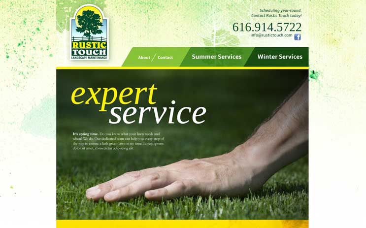
Based in Michigan, this family-owned landscaping business is well aware of the change in seasons and the need to adapt based on the climate on any one particular day. Offering an array of services for both the winter and summer months, and not knowing how the business might grow in the future, I split the information by season to ease navigation and future expandability. The original idea was the home page would actually be split using a script that would allow the “Summer” home page to become more visible as the solstice approached and vice versa. The “Winter” home page would become more visible as its own solstice approached. That proved to be a lot of work so we ended up with four visually-distinct home pages to mark the change in seasons and alert customers and users of the site to the change in landscaping needs. Four sites rolled into one.
This client sought to have a site built where he could counsel future patients via Skype. The subject matter was sensitive therefore we took great care as to how he would come across visually. The idea that he is well-respected, intelligent and compassionate were imperative and remained a focal point throughout the project. We felt it necessary to provide as much, personally, from the Personal Identity Coach as possible and were able to pull off a photo shoot at the Mercantile Library in downtown Cincinnati. It was the perfect locale and gave us the exact feel the site needed.
After having worked on Kestner Waggoner’s brand, they came to us needing a visual revamp of their site along with the ability to update content on the fly. The design picked up on the established color and style of the mark and printed collateral. And while this client worked on the more restorative side of construction, it was construction nonetheless. The solid block of deep red helped bring some muscle into layout while the thin rules on the border hint at the elegance of historical woodworking. This site is a good example of finding balance in design.